
Anda berbicara Bahasa Indonesia? Baca artikel terjemahannya di sini!
Personally, to do list is one type of application I consider paradoxical. It’s very simple; you just add something to do, then cross it out once you’re done. However, I can’t seem to find the one that I’m comfortable using for a long time, even after using more than one alternatives.
To be fair, I want my to do list app to have the following features:
- Available in multiple platforms (Android, iOS, Windows, macOS, web), since I use all of those devices.
- Obviously, since I use multiple device, it needs to be synced in the cloud.
- I don’t want my tasks to be cluttered. It needs to be able to divide tasks into multiple lists, such as shopping, work, etc.
- The task needs to have at least a title and a note.
- The UI needs to be simple and consistent. Focus is important, and I’d rather not spend it navigating through different UI in different platforms.
- No subscriptions, please… if possible.
Some alternatives I tried include Google Tasks, Apple’s own Reminders, Wunderlist, any.do, and Todoist. Unfortunately, none manages to keep me using them for more than a month.
Until I stumbled upon Microsoft’s own To Do app.
Microsoft To Do: At A Glance
Microsoft To Do is available on every current major platform (Android, iOS, macOS, Windows, and web), and very lightweight, at less than 60MB on every platform.
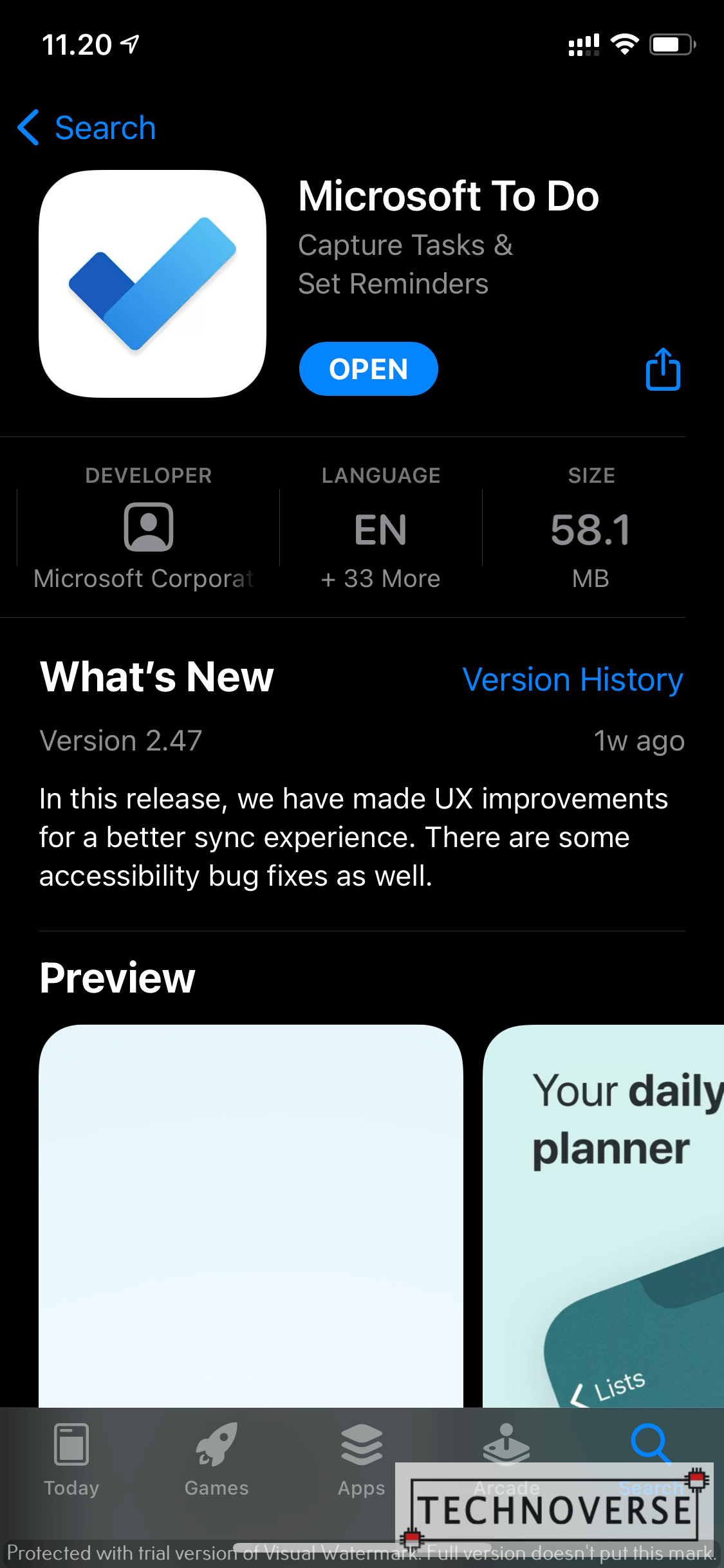
If you’ve used Wunderlist before, you’re going to feel right at home. Well, that makes sense, since Microsoft purchased Wunderlist a few years ago. It’s common for companies to purchase other companies and “absorb” their product, and that’s a good thing.
Anyway, the UI is simple enough for you to understand how to use it at first glance. If you use multiple platforms, rejoice, for the UI is consistent among different platforms, saving you from re-learning the UI. Next, let’s dive deeper into its features, shall we?
Microsoft To Do: Deeper Features
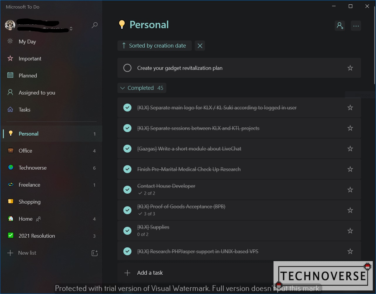
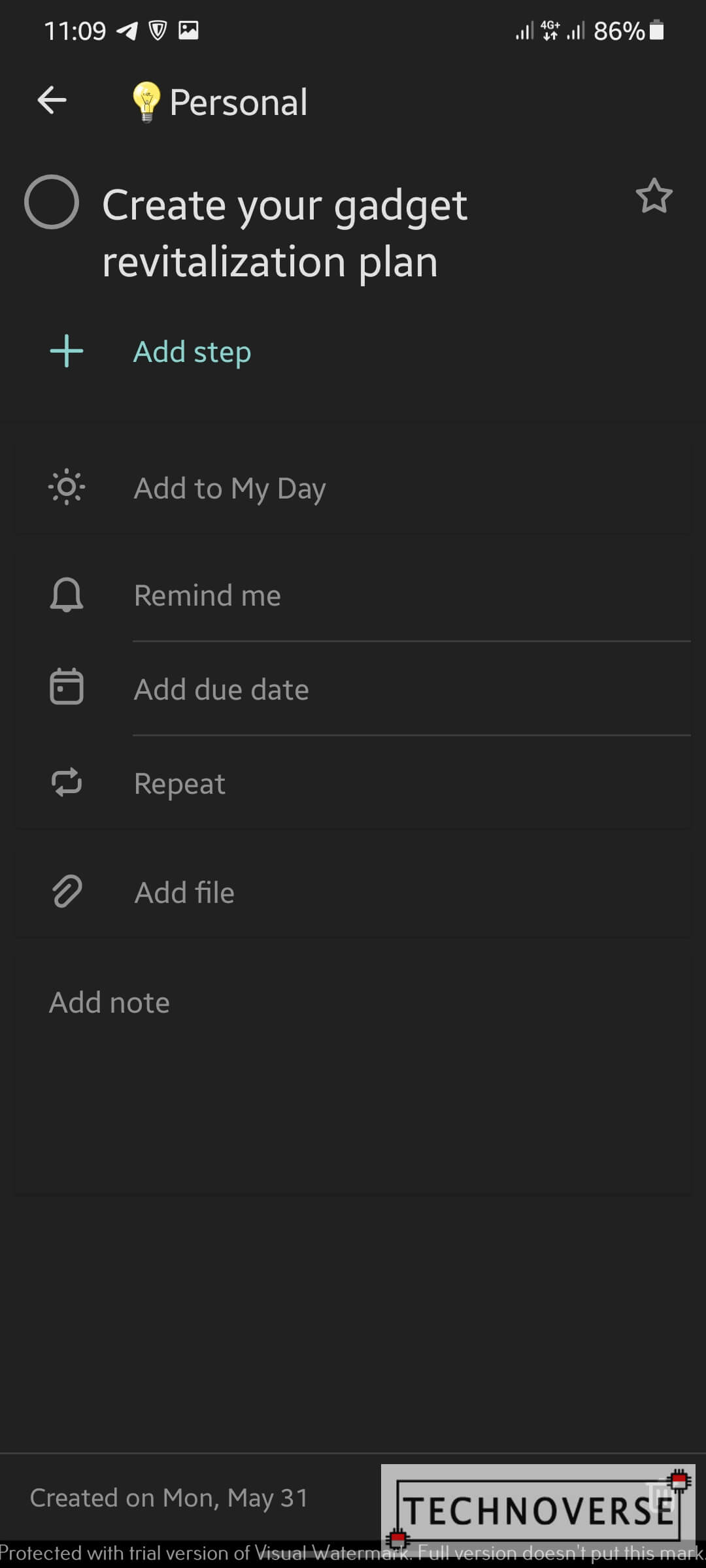
Anatomy of A Microsoft To Do Item
A to do item in Microsoft To Do already covers the basic, such as name, notes, reminder time, and due date. If you’re looking for something more advanced, Microsoft To Do lets you add repetition, file attachment, and event steps, in case you need detailed step-by-step items in your bigger item.
If your item is in a shared list, more on this later, you can assign an item to another user in the list.
Microsoft Account Sync
Well, this one is kind of obvious. To Do is Microsoft’s product, and to use it to the fullest, you’ll need a Microsoft Account, just like Windows. You can skip this, but your tasks won’t be synced in the cloud.
Since I’m already subscribed to Microsoft Office 365 (its pricing is very, very reasonable for what you get, especially in Family pack), I already have a Microsoft account, so this one is a no-brainer.
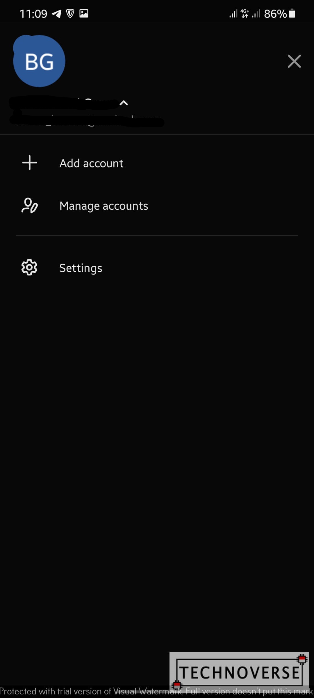
Also, Microsoft To Do supports multiple account, in case you have a separate personal and work account.
Lists, Smart Lists, and Groups
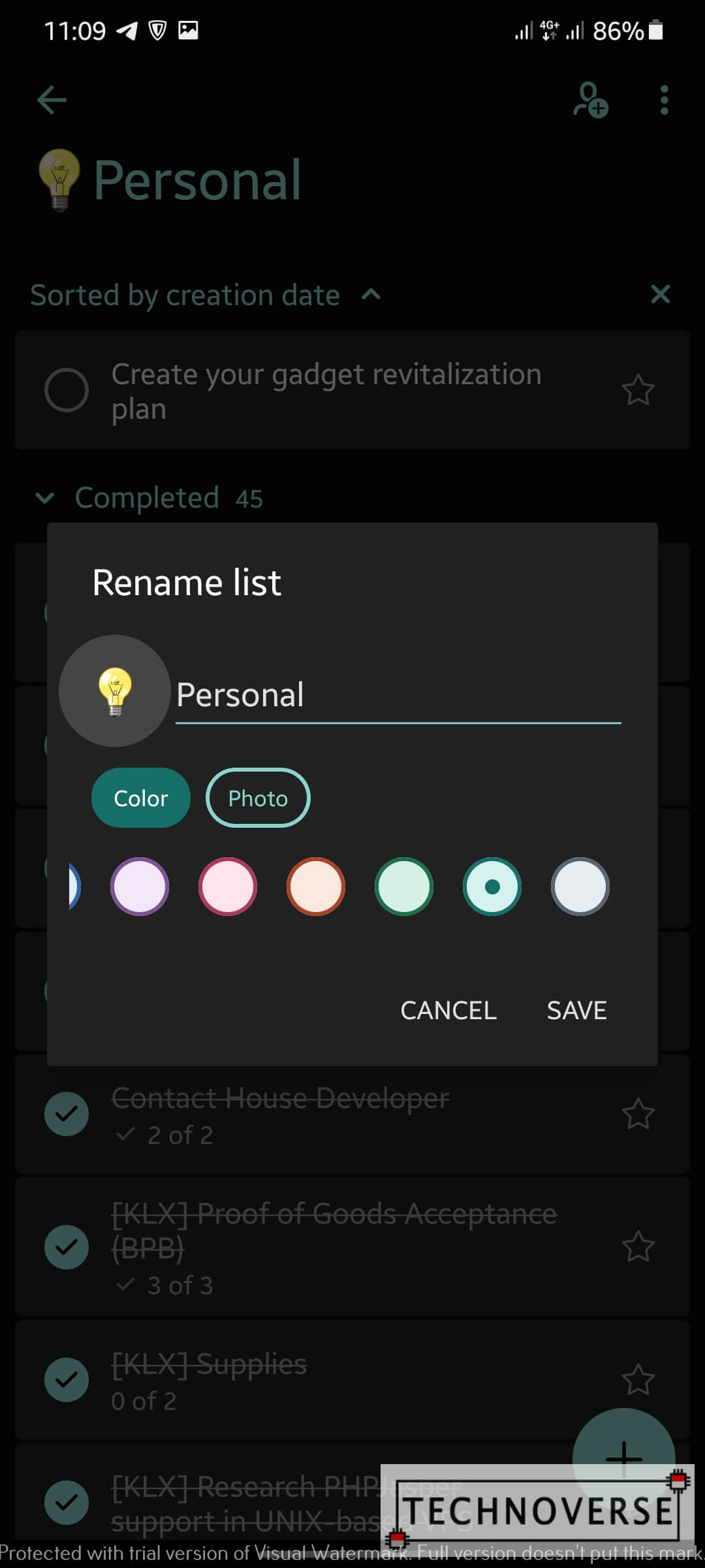
It’s not going to be a decent to do list app without a proper way to categorize them. For example, I have my own list for my work, groceries, hobbies, etc. It’s a very convenient way to organize and focus on what you should do. You can customize your list with different emojis (only available on Android at the time of writing), names, and colors. Additionally, you can invite other people with Microsoft Account to the list. Once someone is invited, you can assign them tasks inside that list, and vice-versa.
Going up one more level, you can also organize your lists into separate groups. This might be useful if you have multiple to do lists for multiple projects.
Aside from manually created lists, Microsoft To Do also has Smart Lists. There are currently 5 smart lists:
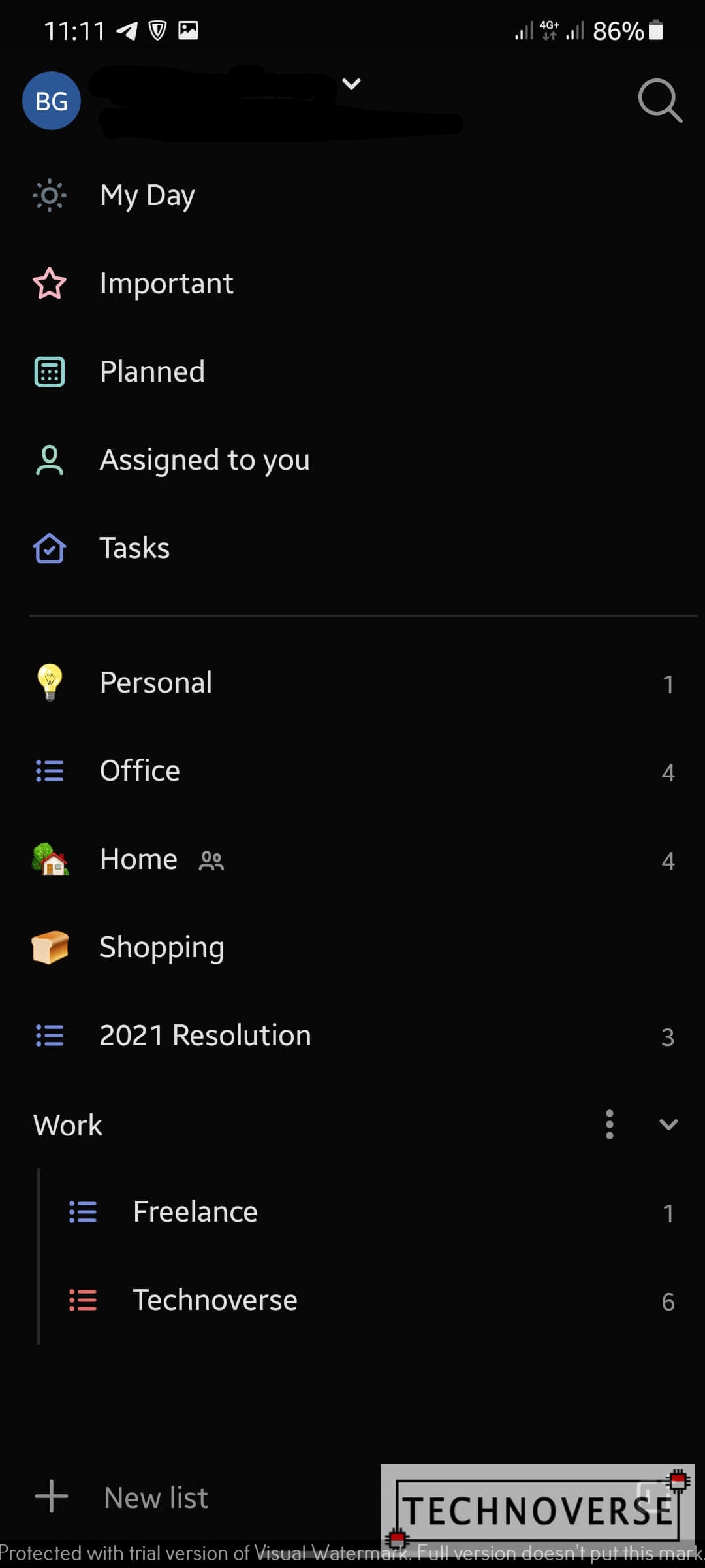
- My Day
- You can tag a to do item as “My Day”, which should be self-explanatory; you’re going to finish it today. Those tagged items will appear in this list.
- Important
- Similar to My Day, you’ll also be able to tag an item as “Important”. If you think prioritizing a task for “My Day” isn’t enough, you might also want to tag it as “Important” 😉
- Planned
- You can assign due dates to your to-dos. All items which have due date will be shown here.
- Assigned to you
- Well, all items which are assigned to you will appear here.
- Tasks
- This is the default list.
Conclusion
If you used Wunderlist before, I’m pretty confident that you’ll find Microsoft To Do familiar, and will have no trouble getting used to. If you didn’t, well, it’s still user friendly. I’m liking it so far, and compared with Google Tasks, I think I prefer this one.
It’s free, it’s available on all major platforms (albeit they don’t get new features at the same time), and it has all the basics covered. As a bonus, you can also collaborate with other people. It covers all the requirements I mentioned at the beginning of this article. What’s not to like?
Well, I guess that’s all for now, Folks. Give Microsoft To Do a try, I hope you’ll like it as much as I do. If you have any questions, as usual, do sound them off in the comments section below. Finally, as usual, thanks for visiting, and I sure hope to see you again in the next article. Cheers and stay safe, Everyone! 😀

